Saturday, 28 April 2018

Friday, 27 April 2018
Evaluation Question 1 - In what ways does your media product use, develop, or challenge forms and conventions of real media products?
Genre
British Analytic philosopher Steve Neale stated that "Genres are instances of repetition and differences" basically saying that video, music etc within a genre all follow the same conventions but have slight differences which helps progress the genre. This is evident with what we did in our video, after researching many videos within the genre (Indie Rock) and looking at digipack/albums and magazine adds we ourselves were able to follow and challenge some conventions.
Genre Conventions:
Music Video:
A convention of the Indie Rock music videos is the narrative of love, this is evident in the video for Lizard State by King Krule and Khmlwugh by HOMESHAKE. We also feature this theme within our video via flashbacks where we see the protagonist and a girl with one another. This is an example of Levi-Strauss' theory of binary opposites which states the majority of narratives have opposing characters which help thicken the plot, in this case a boy and a girl. The idea is developed in our video as in the two videos mention and in the many other of the genre the video is about a specific stage in the relationship while ours features the start, the middle and the end we also feature the pass tense via flash backs while in most indie rock videos, such as the ones mentioned, the theme of love is in the present. We developed the idea as we felt basic narrative of love generally over used.


The video challenges the genre most with it's masonic theme, after watching many videos in the indie rock genre i wasn't able to find one that featured the masonic theme of any other religious related theme. I think the reason for this is that most songs in this genre are generally about more common day to day things such as the aforementioned narrative of love. Although our video does include love the main feature is the masonic process of initiation while the story of love is a secondary story to help develop the main narrative. This complex structure also challenges the genres music videos as i've yet to see a video in this genre which switches between two time frames.
Another convention of Indie Rock is the use of low quality cameras to film this videos to give it a certain aesthetic, evident in Ode to Viceroy by Mac DeMarco and many other videos by him we took from this and used a VHS app to film parts of our video. We did it to differentiate between past and present shots. We developed the convention as we feature HD and low quality VHS (filter) shots which i personally haven't seen on any music videos within the genre. Ode to Viceroy by Mac Demarco did inspire our video in another way too, in this video we see a cigarette packet but instead a video of Mac Demarco smoking is masked on the top half of the box instead of a picture of a disease. We used this masking technique in our video but instead of a cigarette box we instead masked one of flash backs on to the glass of a mirror.


In almost any video of the genre the video features the singer of the band and the singer of the band at some point lip-syncing the words and this is the same within our video but unlike Another One by Mac Demarco or Dum Surfer by King Krule where lip syncing is throughout the majority of the video we only featured it for one line of the song. We challenged this convention because we wanted to focus more on the narrative of the song and not the performance. However we did use the convention of featuring the singer as much as possible as seen in the linked videos as the whole point is to promote the song and it's artist, no better way to promote the artist then featuring then in what is basically a promotional video.


Digipack:
After looking at a number of album covers and the album cover of Salad Days (which features the song we made a video for) we concluded that we should feature the singer on the front and the theme of the album should also be represented on the album cover but in the style of Demarco, on his album This Old Dog the cover features a lot of small hand drawn drawings of random objects, we copied this but instead of random objects we used freemason related drawings like a candle and the freemasonry 'G', this art was used for the inside of the digipack. To maintain relevance between the album cover and the albums songs (or in our case just the song Chamber of Reflection) we took two photos outside of a masonic hall which directly relates to the video which is based on freemasonry. To try link the digipack with the video and song is not only a convention of Indie Rock but a general convention of all music genres, the point of keeping them linked is that they are all there to sell the album and if there isn't a link between the video which intends to promote the album and the album it self then, obviously, the album wont sell as much as people are unable to make the link.

We followed the same conventions as most other digipack covers; name of the artist and the album on the front; tracklist on the back; bar code and record companies logo on the corners of the back. One thing that sort of unconventional was the placement of the tracklist. Usually the tracklist is seen in the centre or on the left of the album while on ours it features on the right, admittedly we were not trying to break conventions by doing this but instead just believed it looked best there due to the colours of the font.
Magazine Add:
From the research we did we found clear conventions in the indie rock genre which the majority of adds featured. Picture of the album, name of the album and artist, positive reviews of the album, similar art as the album, record company and the artist themselves. We followed all these conventions bar the album featuring on the add, these conventions we believed should be followed as they are all informative and help sell the album, breaking conventions is not as necessary here as there is general formula to selling albums which we followed however we did break one convention by not featuring the album cover on the poster, this does sound ridiculous however we believed the album cover and magazine add feature such a similar photo (same people, same location and same angle) that it simply wouldn't be needed to.

Digipack Final
Conventions
- Songlist on back to let the audience know the content of the album
- Artist and title on front to make the digipack immediately recognisable
- Links to album advert and music video in theme and people
- Record label and barcode are required
- Continuous colour theme to provide aesthetic appeal
Unconventional
- Songlist placement, unusual to have them in the top right hand corner instead of middle or left
- Drawings included on the inside. Although most digipacks are more likely to feature further photography, this is actually conventional of the artist - as seen on Mac Demarco's This Old Dog album.
How was it made?
- The drawings were scanned and put into adobe illustrator where they were individually selected and repositioned. Using the eyedropper, a rectangle of the same colour as the masonic hall's door was drawn across the digipack template. The drawings were then grouped together as a single object, repeated to form a pattern design and placed over the blue background
- Each photo was placed into the application before being cropped and moved into place
-Appropriate fonts were chosen for the writing and the eyedropper tool was employed again
- A barcode and record label were taken from the internet, made into vectors and put into place in the corners of the digipack
Survey
https://www.surveymonkey.co.uk/r/RNTXL2M
Above is a link to the survey we sent out, using surveymonkey, to gather feedback on our products. To see an evaluation of the results, click here to go to our evauluation (question 3) video.
Above is a link to the survey we sent out, using surveymonkey, to gather feedback on our products. To see an evaluation of the results, click here to go to our evauluation (question 3) video.
Friday, 20 April 2018
Evaluation Question 2 - How effective was our combination of video & ancillary products?
Above is our evaluation. It looks at how we appealed to the audience with these products, how we represented people within the products and how the different products and platforms were linked together. The video is narrated, so turn up your audio.
Wednesday, 18 April 2018
Evaluation Question 3 - What did we learn from audience feedback?
Below is our presentation showing audience feedback and what we learnt from it. There is narration alongside the images, so be sure to turn up your audio.
Saturday, 31 March 2018
Time Management
In order to efficiently manage time we created
a table weeks in advance of each shoot with details of the date, time of day,
set etc. This allowed for a more efficient shoot as all parties involved knew
where to be and when therefore allowing for maximum time efficiency and
therefore higher quality and a larger range shots.
Scene
|
Set
|
Date/Time
|
Actors/Characters
|
Chamber Of Reflection
|
Living Room, 40 Langford Lane
|
4PM-7:30PM 17th of January 2018
|
Robbie Potts as Freemason
George Charnley-Shaw as Protagonist
|
Bench
|
Ilkley Park bench
|
9AM 16th of February 2018
|
Amy Thornton as Girlfriend
George Charnley-Shaw as Protagonist
|
Bus Stop
|
Out of use bus stop on Albany Walk, Ilkley
|
12PM 16th of February 2018
|
Amy Thornton as Girlfriend
George Charnley-Shaw as Protagonist
|
We also sent texts out to the
actors at a time closer to the shoot just in case they had forgotten.


Thursday, 29 March 2018
Our Album Advert
Conventions:
Includes artists name and album in clear font in order to catch consumers eyes.
Includes date of release to inform possible consumers about when they can buy it.
Includes positive reviews from big name companies such as The Guardian enticing consumers.
Record company in the corner therefore you can still see it but it doesn't obstruct the poster.
Members of the band on the advert.
Non-Conventions:
Doesn't feature an image of the album as we believed it wouldn't be necessary as it the album art is incredibly similar to the poster (Same building, subjects and font).
How we made it:
Firstly using a Nikon camera we took a number of portrait and landscape photos using a variety of poses. We then looked through each picture and chose the one we believed work best as the poster (the one above).
We then put it in Adobe Photoshop and edited the photo to in the contrast and brightness section to have 40 level of contrast.
Opened Adobe Illustrator and set the background to A4.
For the writing we used the text box function and chose the Cooper std and then adjusted the size of the fonts to suit each usage.
We then needed to add the record company, to do this we downloaded the Captured Tracks logo as an image on line and put it into to Adobe Illustrator and changed it into a vector by highlighting it and pressing image trace and then expand, then placed it in the bottom right corner.
Our digipack
Conventions
- Songlist on back to let the audience know the content of the album
- Artist and title on front to make the digipack immediately recognisable
- Links to album advert and music video in theme and people
- Record label and barcode are required
- Continuous colour theme to provide aesthetic appeal
Unconventional
- Songlist placement, unusual to have them in the top right hand corner instead of middle or left
- Drawings included on the inside. Although most digipacks are more likely to feature further photography, this is actually conventional of the artist - as seen on Mac Demarco's This Old Dog album.
How was it made?
- The drawings were scanned and put into adobe illustrator where they were individually selected and repositioned. Using the eyedropper, a rectangle of the same colour as the masonic hall's door was drawn across the digipack template. The drawings were then grouped together as a single object, repeated to form a pattern design and placed over the blue background
- Each photo was placed into the application before being cropped and moved into place
-Appropriate fonts were chosen for the writing and the eyedropper tool was employed again
- A barcode and record label were taken from the internet, made into vectors and put into place in the corners of the digipack
Monday, 26 March 2018
Mirror flashback
To make the mirror flash back the first thing we did is choose a mask from the effects section, we chose the draw mask option as we wanted to get the exact shape of the mirror. We then dragged it over the clip we wanted to mask. We then zoomed in to achieve greater accuracy and began to draw the mask. After this we ticked the invert mask as it was the wrong way round and feathered the mask using the feather slider making it look more realistic. We then placed the clip we wanted in the mirror bellow the clip of the protagonist looking in the mirror. From this point we used a key frame from the point of him opening the mirror to the point of the next clip beginning. The start of the key frame the opacity is 100% while at the end the opacity is 0% which reveals the clip placed on the layer bellow. What this looks like is the contents of the mirror fading into the flashback. We then did the same for the next clip.

Wednesday, 14 March 2018
Digipack idea & feedback
- We like the idea of having a photo of our local masonic hall, in Ilkley, on the back, possibly with our freemason walking in shot. This could present the song list. On the other sides, we could have close up portraits of each of the three characters present. The main character, myself, representing also the artist would probably be on the front.

-We put this idea, with our sketches, to the target audience. We found that although they liked the idea of the photo outside the hall, they thought the close up portraits might be a bit too common and regular, unlike the video. They thought we should have the back cover linked to the front for continuity but do something different for the inside, something which links to Mac DeMarco's style.
-Therefore, we have decided to use two photos from our shoot, one for the front and one for the back. On the inside, we will draw and scan Freemason related drawings in the style of Mac's last album cover, 'This Old Dog.' In this way, it will link to both the artist and the theme of the video. For the background on the inside and fonts on the outside, we thought using the colour of the door might look nice for continuity.
Monday, 5 March 2018
Influences: Mac & George Micheal
In the process of researching and planning our video, these were some of our most important influences.
Firstly, Mac's own work provided us with inspiration in many ways. The ideas of using an app to create an analogue style look to some of our footage, the placing of separate footage onto a mirror in the main footage to represent flashbacks, the beginning of the music's alignment with a visible action and finally the tongue in cheek narrative, theme and character. Read about these inspirations in previous blog posts; 'Ode to Viceroy', 'Mac Demarco' and 'Passing out the Pieces'. Finally, the Freemason induction theme comes directly from the song - with 'Chamber of Reflection' referencing the F.M induction process.


Secondly, we found 80's over the top sickly romantic pop videos by the likes of George Micheal's 'careless whisper' to be laughably cringe with their plots of romantic heartbreak, while at the same time being aesthetically very pleasing. 'Careless Whisper' fades between over-acting George Micheal expressing his turmoil and heartbreak (with screwed up expressions and powerful hand gestures) to beautifully shot flashbacks of a past love on glorious days to intimate low lit bedroom shots. This is where we got the idea to combine a narrative of romantic suffering with our Freemason induction theme. Our main character's 'reflection' will be upon his past romance. He must strike to overcome his turmoil and turn his attention instead to the brotherhood which he is about to enter. Finally, our inspiration from this era is another reason for our choice to use old school analogue filter - hoping to draw a parallel.


Firstly, Mac's own work provided us with inspiration in many ways. The ideas of using an app to create an analogue style look to some of our footage, the placing of separate footage onto a mirror in the main footage to represent flashbacks, the beginning of the music's alignment with a visible action and finally the tongue in cheek narrative, theme and character. Read about these inspirations in previous blog posts; 'Ode to Viceroy', 'Mac Demarco' and 'Passing out the Pieces'. Finally, the Freemason induction theme comes directly from the song - with 'Chamber of Reflection' referencing the F.M induction process.


Thursday, 22 February 2018
Shoot log 2
- We had organised this shoot 3 weeks previously, ensuring our actor was available.
- Meeting at 9am at our first location, a bench in our local park, we filmed our first section quickly with no issues, using a tripod topped with a borrowed iPhone holder, and an iPhone SE. We got everything we need, the shot was backed with trees, fitting with the desired positive feel for this section of the flashbacks and we waited for the sun to shine brightly.
- We went from the animatic, checking each shot before shooting it.
- The second location we had in mind turned out to be too busy with cars going along the road so we had to abandon it for our reserve spot.
- We drove to our reserve second location, for 10am. This was for the first and last flashbacks, set at a bus stop.
- We changed into our second costume, then our third, different but not entirely distinct from our previous clothes. This made the changing of the date clear while providing a continuity of character.
- We changed into our second costume, then our third, different but not entirely distinct from our previous clothes. This made the changing of the date clear while providing a continuity of character.
- At first, we struggled to get the straight on angle we planned due to sunset creating an anaesthetic light balance in the frame. Therefore, we changed the angle to avoid the patch of sunlight in the background and achieved satisfactory footage.
What went well?
- Due to careful planning and timekeeping we made no errors such as forgetting costume or equipment or running out of charge which would have caused a delay. Therefore, we were able to get all the shots for this part of the video in a single day, giving us more time to edit and review the footage.
- We filmed a range of each shot so while editing we have different options to choose from.
What could have gone better?
- We could have taken traffic more into consideration when location scouting so we wouldn't have had to waste time going to the original bus stop plan.
What went well?
- Due to careful planning and timekeeping we made no errors such as forgetting costume or equipment or running out of charge which would have caused a delay. Therefore, we were able to get all the shots for this part of the video in a single day, giving us more time to edit and review the footage.
- We filmed a range of each shot so while editing we have different options to choose from.
What could have gone better?
- We could have taken traffic more into consideration when location scouting so we wouldn't have had to waste time going to the original bus stop plan.
Thursday, 8 February 2018
Rough Cut Evaluation
we managed to get all the shots we planned to by carefully working through the shot list. This meant we did not have to set up for another shoot in this location with these props. We took more than one of each shot to give us choice when editing, allowing for errors such as focus and white balance. Continuation was good, we remembered to keep costume and props the same despite filming with areas. A couple of shadow errors aside, lighting was strong and created clear crisp shots. Our lip syncing was in time and fits with the lyrics, even though in this rough cut it is not at the right point due to missing footage. I believe our shots are interesting and attractive, with a variety of close ups, pans, mid shots and some handheld sections.
Issues
Shadows were a bit of an issue. However, we liked the spooky effect and when we asked potential audience members, they largely agreed. Especially on the white wall. The shadows on the main character's face are not positive in the same way. In several of the takes involving our freemason actor, we found he had glanced at the camera. Luckily there was enough take to use one where he did not but we will bear this in mind when shooting with our next actor.
Whats left to do
There are two sequences we still needed. Firstly, the shot of the freemason and the main character walking down the hallway, and secondly the memory shots, taken on iPhone. We have already filmed the corridor shot and plan to film the iPhone footage on Sunday. Potentilly, we may also need to take another shot of some symbolism, such as a 'G' to put in when the song references the 'better men." Then, we will be able to work towards a final draft.
Monday, 29 January 2018
Album advert research


 The band name is clearly placed at the top of the advert in capital letters. On a white background as appose to the rest of the background, it stands out. This would catch the eye of the consumer, making it clear to them who is bringing out the album. Below, ‘It’s now time to play’ establishes a theme for the advert of a traditional board game. This style of retro product also features on the album art. It is continued lower down the advert with a picture of three children, excited next to a battered board game branded with the album name.
 Sunday, 21 January 2018
CD Case Analysis
1) Eric Clapton - Unplugged
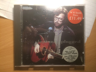
The front cover on the digipack shows a low, spotlight lit shot of the artist performing, playing his guitar. Gold font crosses the photo with the name of the artist and album.
 In continuation from the front cover, a side on, closer picture of the artist looks taken in the same shoot. Down the side, the songs in the album are listed in simple white font to contrast against the black. The barcode is placed in the top left and

On the inside, the same shot from the back is placed more centrally, without the song names, barcode etc. The CD itself is a simple deep blue in a plain black holder.
2) Squeeze - Some fantastic place

The front cover starts the fisheye shot theme off with an orange tinted shot of the band and a small child, with thebans name in blue letters edited in to the same curve created by the fisheye. The fisheye creates a crystal ball effect, appearing to be placed on a blue fabric. A white feather sits above the circle and the album name below in intricate yellow font.

The same crystal ball fisheye effect, a countryside scene is centrally placed, joined by orange song names on a plain blue background.
 The same countryside fisheye shot is shown on the inside cover, this time against a white background. The same blue colour as the back is the background for the CD and the same band name font is placed, in yellow, at the top.
3) Led Zeppelin
 On the front cover, an unusual framed photo of a man carrying a heavy load is shown against a background of peeling wallpaper. It is slightly off centre and takes up a large portion of the frame. No other details are present, not even the name of the album. This is an interesting design, focused on a single object. Eye-catching and simplistic, I would consider creating a similar front cover.
 On the background, a shot of rooftops and a tree fills he bottom half of the shot and song names in white are central, from top to bottom.

On the inside, there is a further out shot of the same landscape. The CD is split red and green.
4) Kings of Leon - Only by night


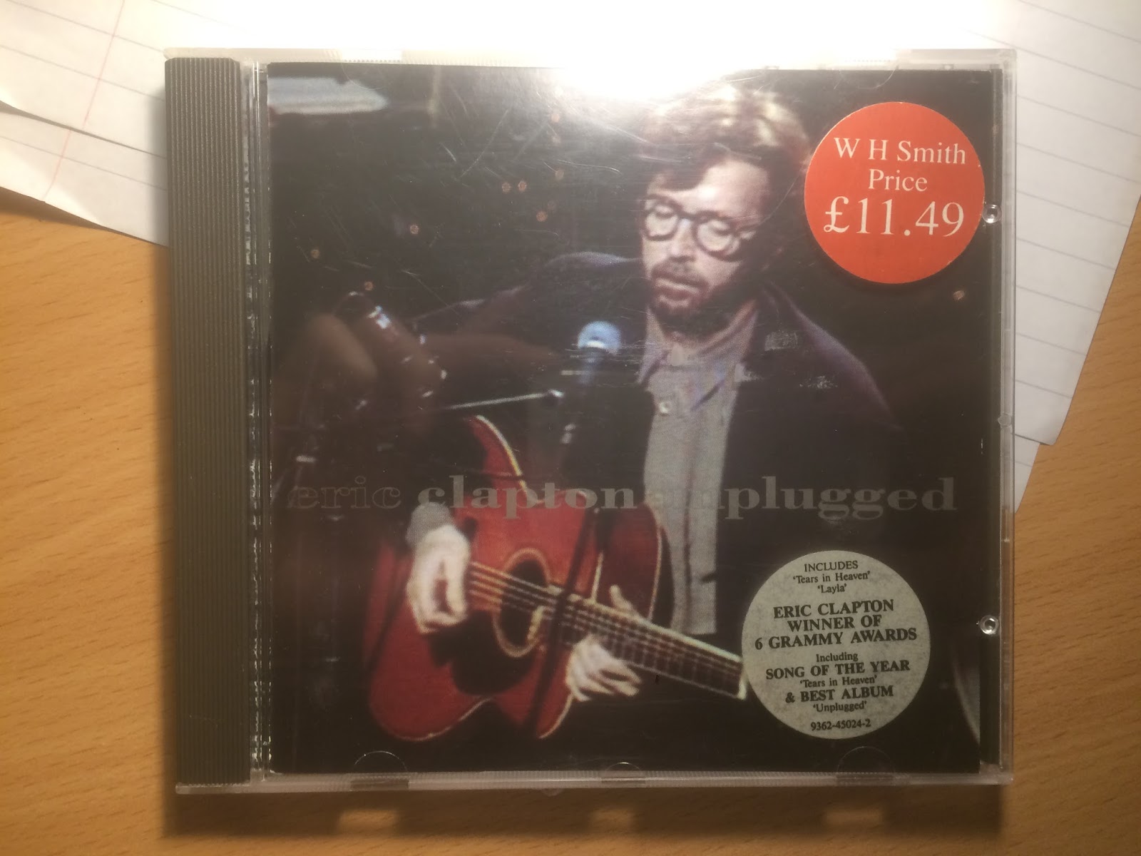
The front cover on the digipack shows a low, spotlight lit shot of the artist performing, playing his guitar. Gold font crosses the photo with the name of the artist and album.


2) Squeeze - Some fantastic place

The front cover starts the fisheye shot theme off with an orange tinted shot of the band and a small child, with thebans name in blue letters edited in to the same curve created by the fisheye. The fisheye creates a crystal ball effect, appearing to be placed on a blue fabric. A white feather sits above the circle and the album name below in intricate yellow font.

The same crystal ball fisheye effect, a countryside scene is centrally placed, joined by orange song names on a plain blue background.

3) Led Zeppelin


On the inside, there is a further out shot of the same landscape. The CD is split red and green.
4) Kings of Leon - Only by night


Thursday, 18 January 2018
Shoot Log 1
yesterday, on the 17th of January, we had our first shoot. It included Me as the newcomer, Robbie as the lead freemason and Otis as cameraman. It was shot at my house in the evening.
- Firstly, we stripped 2 of the room's walls of furniture, posters and ornaments, in accordance with the chamber's desired bare feel
-We then organised costume, giving Robbie his freemason uniform and me getting into a casual shirt.
- Next we had planned to print off freemason symbols or pictures to include in the video. We should have done this in advance, as my printer was broken and this meant, through error, only one of three photos was printed large enough to be used.
- We set up the camera and lighting using two tripods to make things easier for ourselves.
- After going over the storyboard, we laid it out and began working through the shots we needed in the room. We started with shots which featured Robbie as the main Freemason as he was busy and we didnt want to make him wait for the 2 shots he featured in.
Went well
-Actor organisation. We ensured the actor was told about the shoot well in advance and reminded him on the day.
Could have gone better
-Prop organisation. We should have found and printed the freemason pictures in advance to prevent time wasting.
- Firstly, we stripped 2 of the room's walls of furniture, posters and ornaments, in accordance with the chamber's desired bare feel
-We then organised costume, giving Robbie his freemason uniform and me getting into a casual shirt.
- Next we had planned to print off freemason symbols or pictures to include in the video. We should have done this in advance, as my printer was broken and this meant, through error, only one of three photos was printed large enough to be used.
- We set up the camera and lighting using two tripods to make things easier for ourselves.
- After going over the storyboard, we laid it out and began working through the shots we needed in the room. We started with shots which featured Robbie as the main Freemason as he was busy and we didnt want to make him wait for the 2 shots he featured in.
Went well
-Actor organisation. We ensured the actor was told about the shoot well in advance and reminded him on the day.
Could have gone better
-Prop organisation. We should have found and printed the freemason pictures in advance to prevent time wasting.
Wednesday, 10 January 2018
Props
To give the rise en scene of the chamber an effective feel we have carefully considered props.
Here are some items which we feel would enhance the mise en scene in the room.
-Sand Timer (needed)
-Old Book (desired)
-Skull/bones (desired)
-Candlestick (desired)
-Glass (needed)
-Bottles of unknown substances (desired)
- FM related pictures/ symbols (needed)
The photo below is an example of some of the images which have inspired our ideas for the chamber.

Of the items listed, it is only the bones and the pictures/ symbols which we are missing. We will focus on getting the pictures and symbols of freemasonry together as they feature in important shots. We will also look into borrowing bones from the art department but this is not a necessity.
Here are some items which we feel would enhance the mise en scene in the room.
-Sand Timer (needed)
-Old Book (desired)
-Skull/bones (desired)
-Candlestick (desired)
-Glass (needed)
-Bottles of unknown substances (desired)
- FM related pictures/ symbols (needed)
The photo below is an example of some of the images which have inspired our ideas for the chamber.
Of the items listed, it is only the bones and the pictures/ symbols which we are missing. We will focus on getting the pictures and symbols of freemasonry together as they feature in important shots. We will also look into borrowing bones from the art department but this is not a necessity.
Subscribe to:
Posts (Atom)

-
Visuals & Lyrics relationship There is a tight link between the two in this video, directed by the lead singer of the band himsel...
-
 Mac Demarco - Passing Out Pieces Firstly, we liked the way the music began with a visual action. In this video, it is the shooting of o...
 -
Overview "Drop" is a single released by Alternative Hip-Hop group The Phar...

