Firstly, Mac's own work provided us with inspiration in many ways. The ideas of using an app to create an analogue style look to some of our footage, the placing of separate footage onto a mirror in the main footage to represent flashbacks, the beginning of the music's alignment with a visible action and finally the tongue in cheek narrative, theme and character. Read about these inspirations in previous blog posts; 'Ode to Viceroy', 'Mac Demarco' and 'Passing out the Pieces'. Finally, the Freemason induction theme comes directly from the song - with 'Chamber of Reflection' referencing the F.M induction process.
Monday, 5 March 2018
Influences: Mac & George Micheal
In the process of researching and planning our video, these were some of our most important influences.
Firstly, Mac's own work provided us with inspiration in many ways. The ideas of using an app to create an analogue style look to some of our footage, the placing of separate footage onto a mirror in the main footage to represent flashbacks, the beginning of the music's alignment with a visible action and finally the tongue in cheek narrative, theme and character. Read about these inspirations in previous blog posts; 'Ode to Viceroy', 'Mac Demarco' and 'Passing out the Pieces'. Finally, the Freemason induction theme comes directly from the song - with 'Chamber of Reflection' referencing the F.M induction process.
Secondly, we found 80's over the top sickly romantic pop videos by the likes of George Micheal's 'careless whisper' to be laughably cringe with their plots of romantic heartbreak, while at the same time being aesthetically very pleasing. 'Careless Whisper' fades between over-acting George Micheal expressing his turmoil and heartbreak (with screwed up expressions and powerful hand gestures) to beautifully shot flashbacks of a past love on glorious days to intimate low lit bedroom shots. This is where we got the idea to combine a narrative of romantic suffering with our Freemason induction theme. Our main character's 'reflection' will be upon his past romance. He must strike to overcome his turmoil and turn his attention instead to the brotherhood which he is about to enter. Finally, our inspiration from this era is another reason for our choice to use old school analogue filter - hoping to draw a parallel.
Firstly, Mac's own work provided us with inspiration in many ways. The ideas of using an app to create an analogue style look to some of our footage, the placing of separate footage onto a mirror in the main footage to represent flashbacks, the beginning of the music's alignment with a visible action and finally the tongue in cheek narrative, theme and character. Read about these inspirations in previous blog posts; 'Ode to Viceroy', 'Mac Demarco' and 'Passing out the Pieces'. Finally, the Freemason induction theme comes directly from the song - with 'Chamber of Reflection' referencing the F.M induction process.
Thursday, 22 February 2018
Shoot log 2
- We had organised this shoot 3 weeks previously, ensuring our actor was available.
- Meeting at 9am at our first location, a bench in our local park, we filmed our first section quickly with no issues, using a tripod topped with a borrowed iPhone holder, and an iPhone SE. We got everything we need, the shot was backed with trees, fitting with the desired positive feel for this section of the flashbacks and we waited for the sun to shine brightly.
- We went from the animatic, checking each shot before shooting it.
- The second location we had in mind turned out to be too busy with cars going along the road so we had to abandon it for our reserve spot.
- We drove to our reserve second location, for 10am. This was for the first and last flashbacks, set at a bus stop.
- We changed into our second costume, then our third, different but not entirely distinct from our previous clothes. This made the changing of the date clear while providing a continuity of character.
- At first, we struggled to get the straight on angle we planned due to sunset creating an anaesthetic light balance in the frame. Therefore, we changed the angle to avoid the patch of sunlight in the background and achieved satisfactory footage.
What went well?
- Due to careful planning and timekeeping we made no errors such as forgetting costume or equipment or running out of charge which would have caused a delay. Therefore, we were able to get all the shots for this part of the video in a single day, giving us more time to edit and review the footage.
- We filmed a range of each shot so while editing we have different options to choose from.
What could have gone better?
- We could have taken traffic more into consideration when location scouting so we wouldn't have had to waste time going to the original bus stop plan.
What went well?
- Due to careful planning and timekeeping we made no errors such as forgetting costume or equipment or running out of charge which would have caused a delay. Therefore, we were able to get all the shots for this part of the video in a single day, giving us more time to edit and review the footage.
- We filmed a range of each shot so while editing we have different options to choose from.
What could have gone better?
- We could have taken traffic more into consideration when location scouting so we wouldn't have had to waste time going to the original bus stop plan.
Thursday, 8 February 2018
Rough Cut Evaluation
we managed to get all the shots we planned to by carefully working through the shot list. This meant we did not have to set up for another shoot in this location with these props. We took more than one of each shot to give us choice when editing, allowing for errors such as focus and white balance. Continuation was good, we remembered to keep costume and props the same despite filming with areas. A couple of shadow errors aside, lighting was strong and created clear crisp shots. Our lip syncing was in time and fits with the lyrics, even though in this rough cut it is not at the right point due to missing footage. I believe our shots are interesting and attractive, with a variety of close ups, pans, mid shots and some handheld sections.
Issues
Shadows were a bit of an issue. However, we liked the spooky effect and when we asked potential audience members, they largely agreed. Especially on the white wall. The shadows on the main character's face are not positive in the same way. In several of the takes involving our freemason actor, we found he had glanced at the camera. Luckily there was enough take to use one where he did not but we will bear this in mind when shooting with our next actor.
Whats left to do
There are two sequences we still needed. Firstly, the shot of the freemason and the main character walking down the hallway, and secondly the memory shots, taken on iPhone. We have already filmed the corridor shot and plan to film the iPhone footage on Sunday. Potentilly, we may also need to take another shot of some symbolism, such as a 'G' to put in when the song references the 'better men." Then, we will be able to work towards a final draft.
Monday, 29 January 2018
Album advert research
The poster features a picture of the album at the bottom left, this is to inform the users what to look out for. The albums art is similar to the art of the poster, similar colours, so it maintains the same ascetic. The black and white photo is also a signifier to the consumer of a more classic, simple sound. There font used for 'AVAILABLE EVERYWHERE NOW' is in colour while the rest of the poster is black and white, this stands and therefore really helps emphasise the availability of the album to possible consumers. The record companies logo can be seen at the bottom left, featuring the record company is a convention in music posters as it helps advertise the company to the other artist looking for distribution. Poster mentions that it has won two Grammys, this is to inform possible consumers of how good the album is in hope they will buy it. Informs readers of the poster that the album features the single 'Rolling in the Deep' which was a huge hist and the time, this will lead to consumers believing that the album itself may be of similar standard and therefore incentivise them to buy it.

Jake Bugg's poster is very similar Adele's, they have similar features such as; artist's name in big clear writing; the album cover; singles which feature within the album; the record company; a clear picture on the artist (both on the album and poster) and when/if the album is released. This suggests that the music industry follows the same conventions when trying to advertise music especially considering that they are not even on the same record companies, for our own we intend to follow some but not all of these conventions as we believe that it is simply boring and lacks innovation if we were just to follow the same things as these artists did.
The band name is clearly placed at the top of the advert in capital letters. On a white background as appose to the rest of the background, it stands out. This would catch the eye of the consumer, making it clear to them who is bringing out the album. Below, ‘It’s now time to play’ establishes a theme for the advert of a traditional board game. This style of retro product also features on the album art. It is continued lower down the advert with a picture of three children, excited next to a battered board game branded with the album name.

The band name is clearly placed at the top of the advert in capital letters. On a white background as appose to the rest of the background, it stands out. This would catch the eye of the consumer, making it clear to them who is bringing out the album. Below, ‘It’s now time to play’ establishes a theme for the advert of a traditional board game. This style of retro product also features on the album art. It is continued lower down the advert with a picture of three children, excited next to a battered board game branded with the album name. Sunday, 21 January 2018
CD Case Analysis
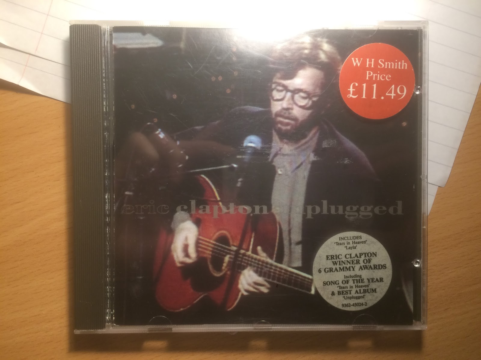
1) Eric Clapton - Unplugged
The front cover on the digipack shows a low, spotlight lit shot of the artist performing, playing his guitar. Gold font crosses the photo with the name of the artist and album.
In continuation from the front cover, a side on, closer picture of the artist looks taken in the same shoot. Down the side, the songs in the album are listed in simple white font to contrast against the black. The barcode is placed in the top left and
On the inside, the same shot from the back is placed more centrally, without the song names, barcode etc. The CD itself is a simple deep blue in a plain black holder.
2) Squeeze - Some fantastic place
The front cover starts the fisheye shot theme off with an orange tinted shot of the band and a small child, with thebans name in blue letters edited in to the same curve created by the fisheye. The fisheye creates a crystal ball effect, appearing to be placed on a blue fabric. A white feather sits above the circle and the album name below in intricate yellow font.
The same crystal ball fisheye effect, a countryside scene is centrally placed, joined by orange song names on a plain blue background.
The same countryside fisheye shot is shown on the inside cover, this time against a white background. The same blue colour as the back is the background for the CD and the same band name font is placed, in yellow, at the top.
3) Led Zeppelin
On the front cover, an unusual framed photo of a man carrying a heavy load is shown against a background of peeling wallpaper. It is slightly off centre and takes up a large portion of the frame. No other details are present, not even the name of the album. This is an interesting design, focused on a single object. Eye-catching and simplistic, I would consider creating a similar front cover.
On the background, a shot of rooftops and a tree fills he bottom half of the shot and song names in white are central, from top to bottom.
On the inside, there is a further out shot of the same landscape. The CD is split red and green.
4) Kings of Leon - Only by night
The front cover on the digipack shows a low, spotlight lit shot of the artist performing, playing his guitar. Gold font crosses the photo with the name of the artist and album.
In continuation from the front cover, a side on, closer picture of the artist looks taken in the same shoot. Down the side, the songs in the album are listed in simple white font to contrast against the black. The barcode is placed in the top left and
2) Squeeze - Some fantastic place
The front cover starts the fisheye shot theme off with an orange tinted shot of the band and a small child, with thebans name in blue letters edited in to the same curve created by the fisheye. The fisheye creates a crystal ball effect, appearing to be placed on a blue fabric. A white feather sits above the circle and the album name below in intricate yellow font.
The same crystal ball fisheye effect, a countryside scene is centrally placed, joined by orange song names on a plain blue background.
The same countryside fisheye shot is shown on the inside cover, this time against a white background. The same blue colour as the back is the background for the CD and the same band name font is placed, in yellow, at the top.
3) Led Zeppelin
On the front cover, an unusual framed photo of a man carrying a heavy load is shown against a background of peeling wallpaper. It is slightly off centre and takes up a large portion of the frame. No other details are present, not even the name of the album. This is an interesting design, focused on a single object. Eye-catching and simplistic, I would consider creating a similar front cover.
On the background, a shot of rooftops and a tree fills he bottom half of the shot and song names in white are central, from top to bottom.
On the inside, there is a further out shot of the same landscape. The CD is split red and green.
4) Kings of Leon - Only by night
Thursday, 18 January 2018
Shoot Log 1
yesterday, on the 17th of January, we had our first shoot. It included Me as the newcomer, Robbie as the lead freemason and Otis as cameraman. It was shot at my house in the evening.
- Firstly, we stripped 2 of the room's walls of furniture, posters and ornaments, in accordance with the chamber's desired bare feel
-We then organised costume, giving Robbie his freemason uniform and me getting into a casual shirt.
- Next we had planned to print off freemason symbols or pictures to include in the video. We should have done this in advance, as my printer was broken and this meant, through error, only one of three photos was printed large enough to be used.
- We set up the camera and lighting using two tripods to make things easier for ourselves.
- After going over the storyboard, we laid it out and began working through the shots we needed in the room. We started with shots which featured Robbie as the main Freemason as he was busy and we didnt want to make him wait for the 2 shots he featured in.
Went well
-Actor organisation. We ensured the actor was told about the shoot well in advance and reminded him on the day.
Could have gone better
-Prop organisation. We should have found and printed the freemason pictures in advance to prevent time wasting.
- Firstly, we stripped 2 of the room's walls of furniture, posters and ornaments, in accordance with the chamber's desired bare feel
-We then organised costume, giving Robbie his freemason uniform and me getting into a casual shirt.
- Next we had planned to print off freemason symbols or pictures to include in the video. We should have done this in advance, as my printer was broken and this meant, through error, only one of three photos was printed large enough to be used.
- We set up the camera and lighting using two tripods to make things easier for ourselves.
- After going over the storyboard, we laid it out and began working through the shots we needed in the room. We started with shots which featured Robbie as the main Freemason as he was busy and we didnt want to make him wait for the 2 shots he featured in.
Went well
-Actor organisation. We ensured the actor was told about the shoot well in advance and reminded him on the day.
Could have gone better
-Prop organisation. We should have found and printed the freemason pictures in advance to prevent time wasting.
Wednesday, 10 January 2018
Props
To give the rise en scene of the chamber an effective feel we have carefully considered props.
Here are some items which we feel would enhance the mise en scene in the room.
-Sand Timer (needed)
-Old Book (desired)
-Skull/bones (desired)
-Candlestick (desired)
-Glass (needed)
-Bottles of unknown substances (desired)
- FM related pictures/ symbols (needed)
The photo below is an example of some of the images which have inspired our ideas for the chamber.
Of the items listed, it is only the bones and the pictures/ symbols which we are missing. We will focus on getting the pictures and symbols of freemasonry together as they feature in important shots. We will also look into borrowing bones from the art department but this is not a necessity.
Here are some items which we feel would enhance the mise en scene in the room.
-Sand Timer (needed)
-Old Book (desired)
-Skull/bones (desired)
-Candlestick (desired)
-Glass (needed)
-Bottles of unknown substances (desired)
- FM related pictures/ symbols (needed)
The photo below is an example of some of the images which have inspired our ideas for the chamber.
Of the items listed, it is only the bones and the pictures/ symbols which we are missing. We will focus on getting the pictures and symbols of freemasonry together as they feature in important shots. We will also look into borrowing bones from the art department but this is not a necessity.
Subscribe to:
Posts (Atom)
-
Visuals & Lyrics relationship There is a tight link between the two in this video, directed by the lead singer of the band himsel...
-
Mac Demarco - Passing Out Pieces Firstly, we liked the way the music began with a visual action. In this video, it is the shooting of o...
-
Overview "Drop" is a single released by Alternative Hip-Hop group The Phar...